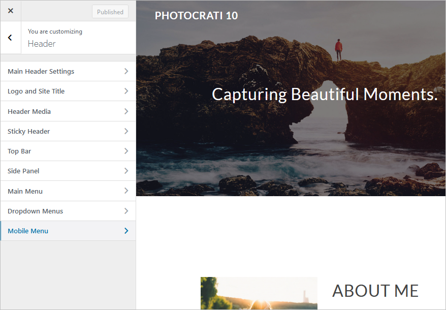
Navigate to Appearance > Customize > Header > Mobile Menu to style the mobile view of your site navigation.
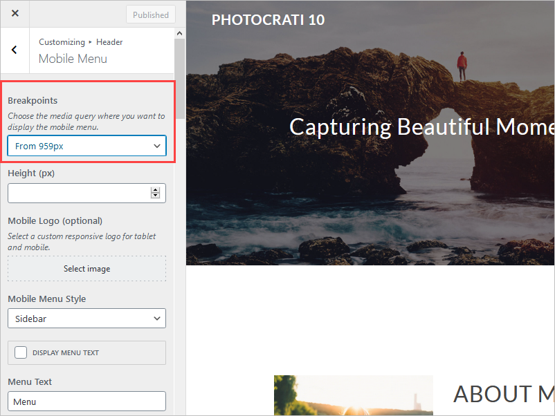
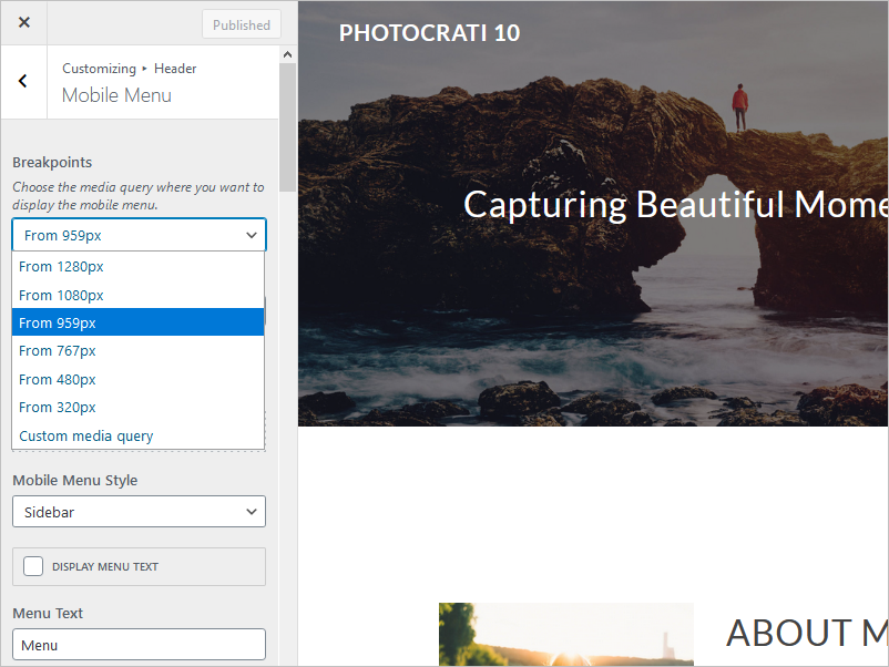
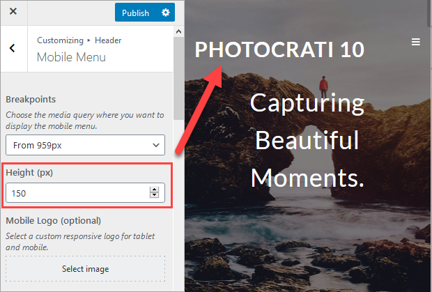
- Breakpoints: Choose the media query where you want to display the mobile menu.
- Height (px): You can adjust the location of the mobile menu taking into consideration the top of the page.
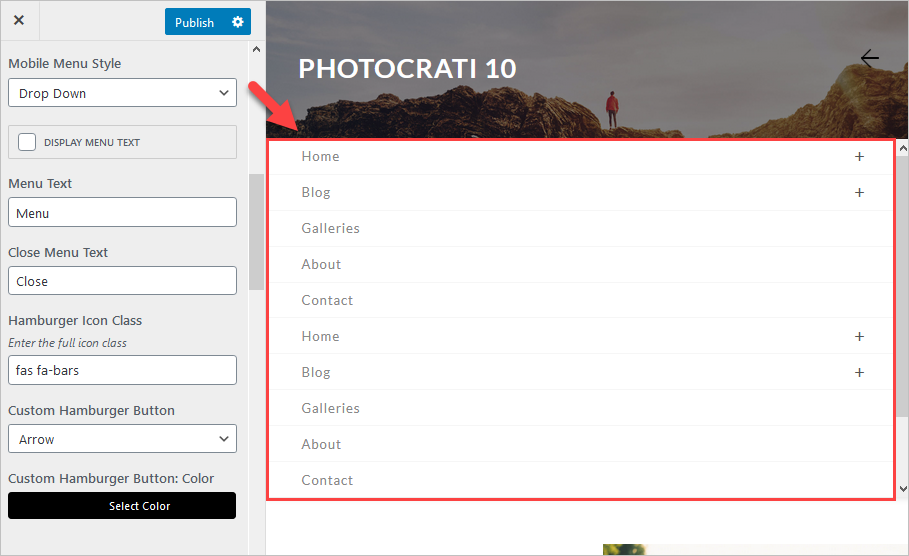
- Mobile Menu Style: Sidebarm, Drop Down, and Full screen.
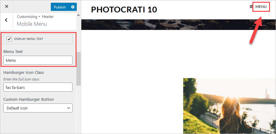
- Display menu text: it shows the text beside the menu icon.
- Menu text: The text that you want to include.
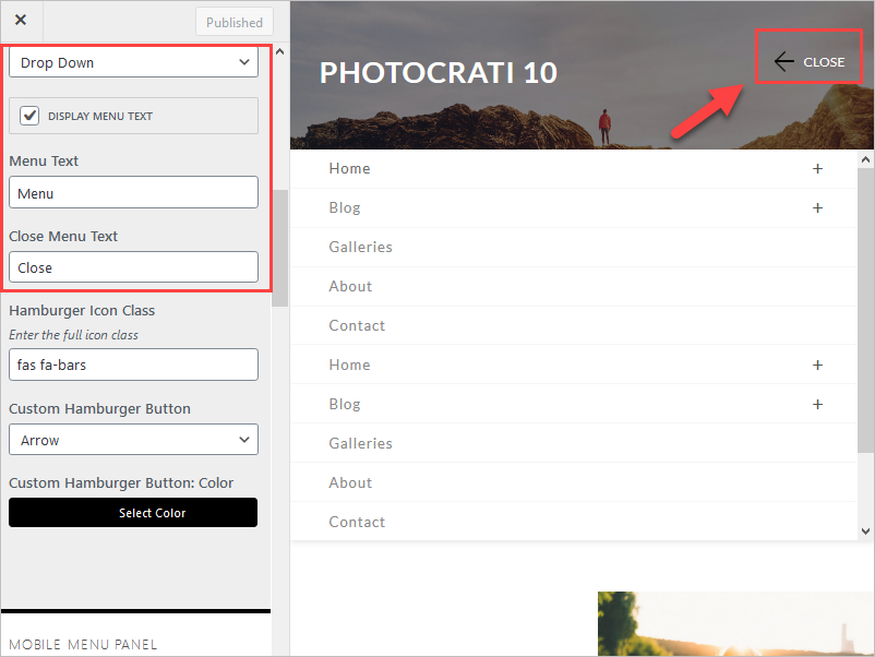
- Close Menu Text (available with the Dropdown style)
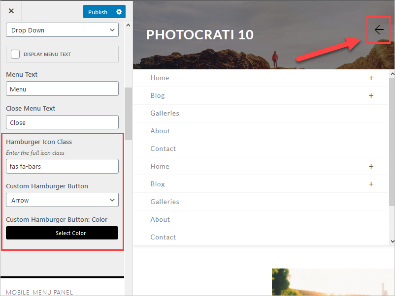
- Hamburger Icon Class: Enter the full icon class. You can adjust the class that you will use as your hamburger menu on mobile devices.
- Custom Hamburger Button: Once the menu is open, it will replace the hamburger icon with the one you choose here.
- Custom Hamburger Button: Color. You can adjust the color of the hamburger icon used to open the mobile menu.
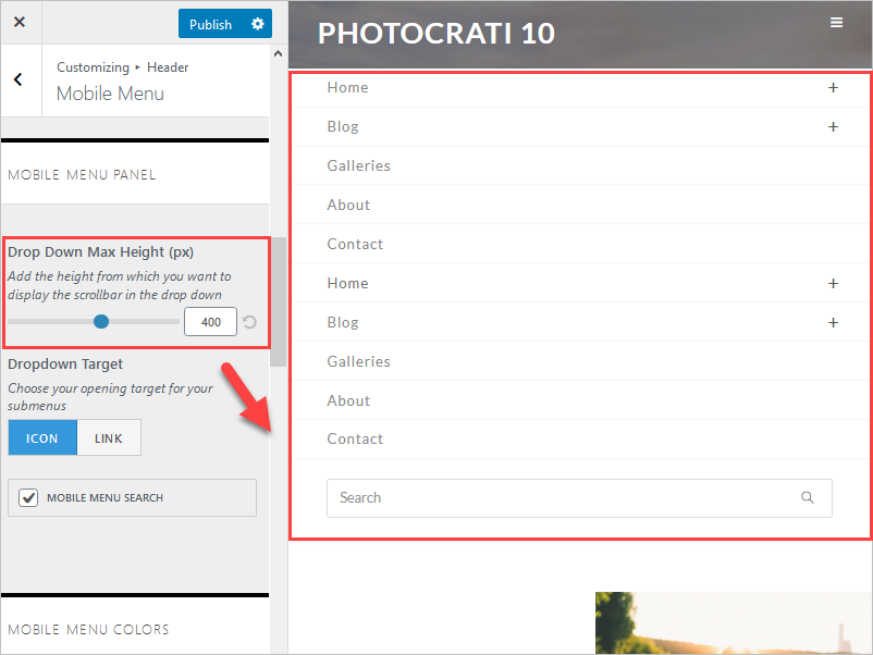
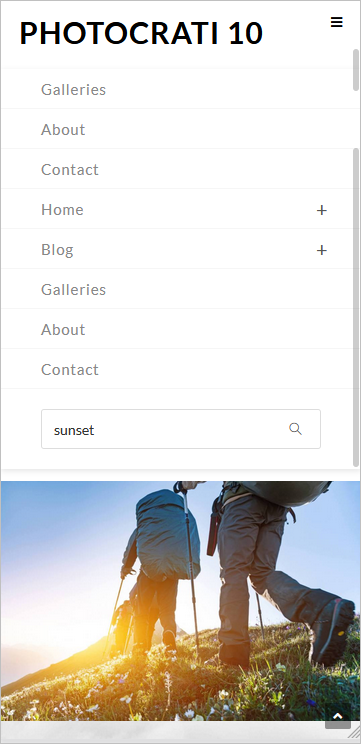
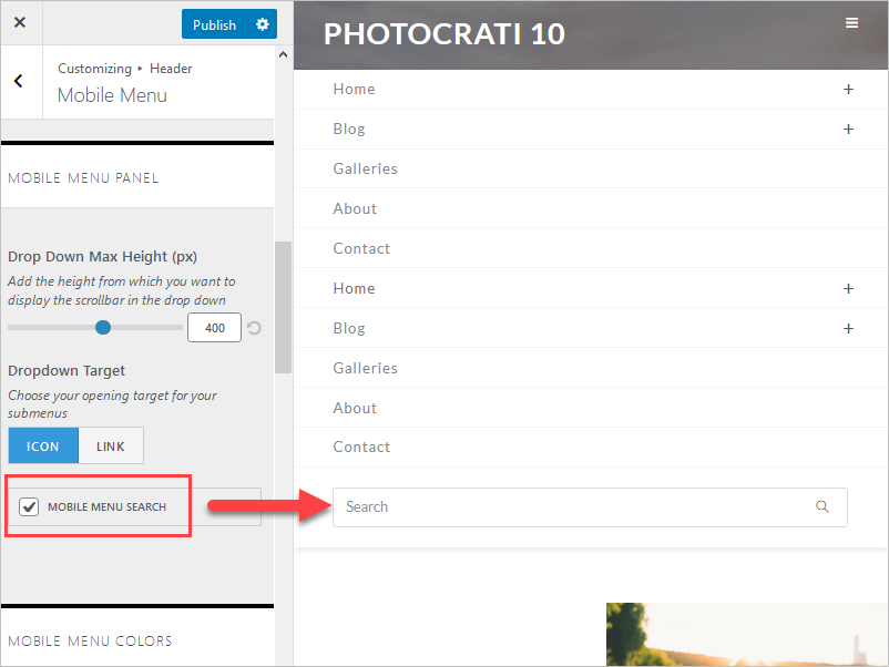
- Drop Down Max Height (px): Add the height from which you want to display the scrollbar in the dropdown.
Note: This option is available only on the Dropdown menu style.
- Direction (sidebar style): adjust the location of the sidebar style menu on mobile devices.
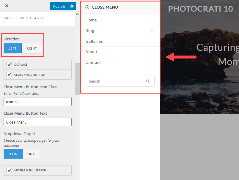
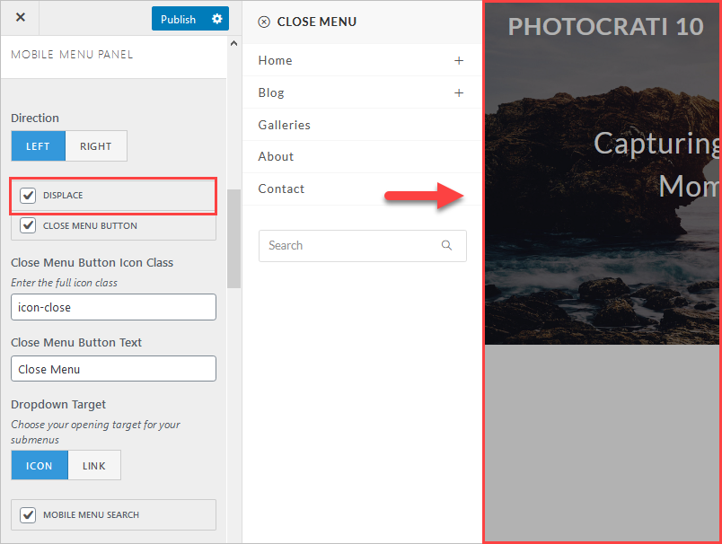
- Displace (sidebar style): Displace the background underneath the overlay instead of covering the page with the sidebar menu.
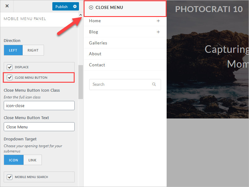
- Close Menu Button: Makes the close button visible.
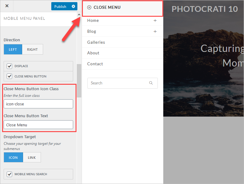
- Close Menu Button Icon Class: You can adjust the CSS class being used by the close icon.
- Close Menu Button Text: You can change the label used for the Close Button.
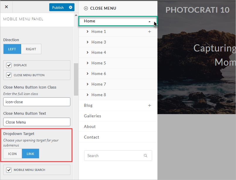
- Dropdown Target: Chose to use an icon or the complete link to open sub-menus.
- Mobile Menu Search: Enable the search option on mobile.
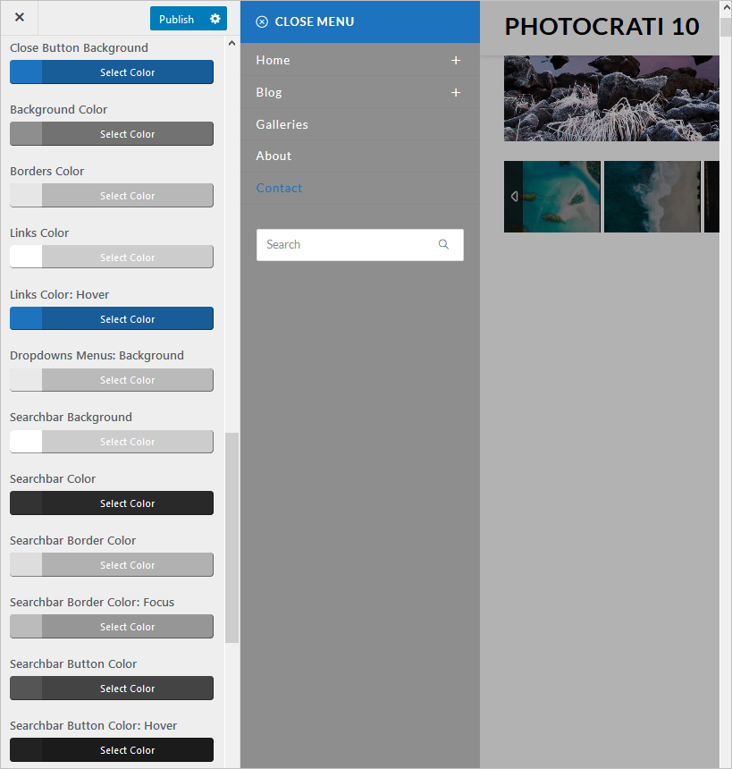
- Mobile Menu Colors: Adjust the colors of the mobile menu, we have many options:
- Close Button Background.
- Background Color.
- Borders Color.
- Links Color.
- Links Color Hover.
- Dropdowns Menus: Background.
- Searchbar Background.
- Searchbar Color.
- Search Border Color.
- Searchbar Button Color.
- Searchbar Button Color: Hover.
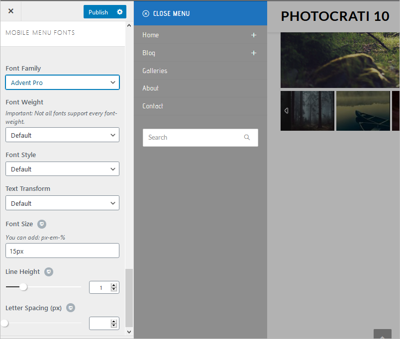
- Mobile Menu Fonts:
- Font Family.
- Font Style.
- Text Transform.
- Font Size.
- Line Height.
- Letter Spacing (px).
