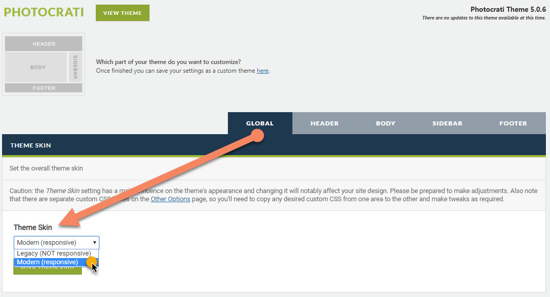
The Theme skin is the underlying CSS stylesheet that displays your theme style and structure…
LEGACY
Legacy is NOT responsive. We are leaving this option for those running existing versions of the Photocrati Theme (v4.7.3 and older). This is to be backwards compatible, but we recommend using the Modern skin (responsive) to be fully compatible with all mobile displays.
MODERN
The modern theme skin is fully responsive and will display on all mobile devices. This will be the default skin if you are installing for the first time as of v4.8, or if you set any preset under Theme Options > Choose Theme after installing v4.8 update.
—
*!IMPORTANT – Caution: the Theme Skin setting has a major influence on the theme’s appearance and changing it will notably affect your site design. Please be prepared to make adjustments. Also note that there are separate custom CSS boxes on the Other Options page, so you’ll need to copy any desired custom CSS from one area to the other and make tweaks as required.
—
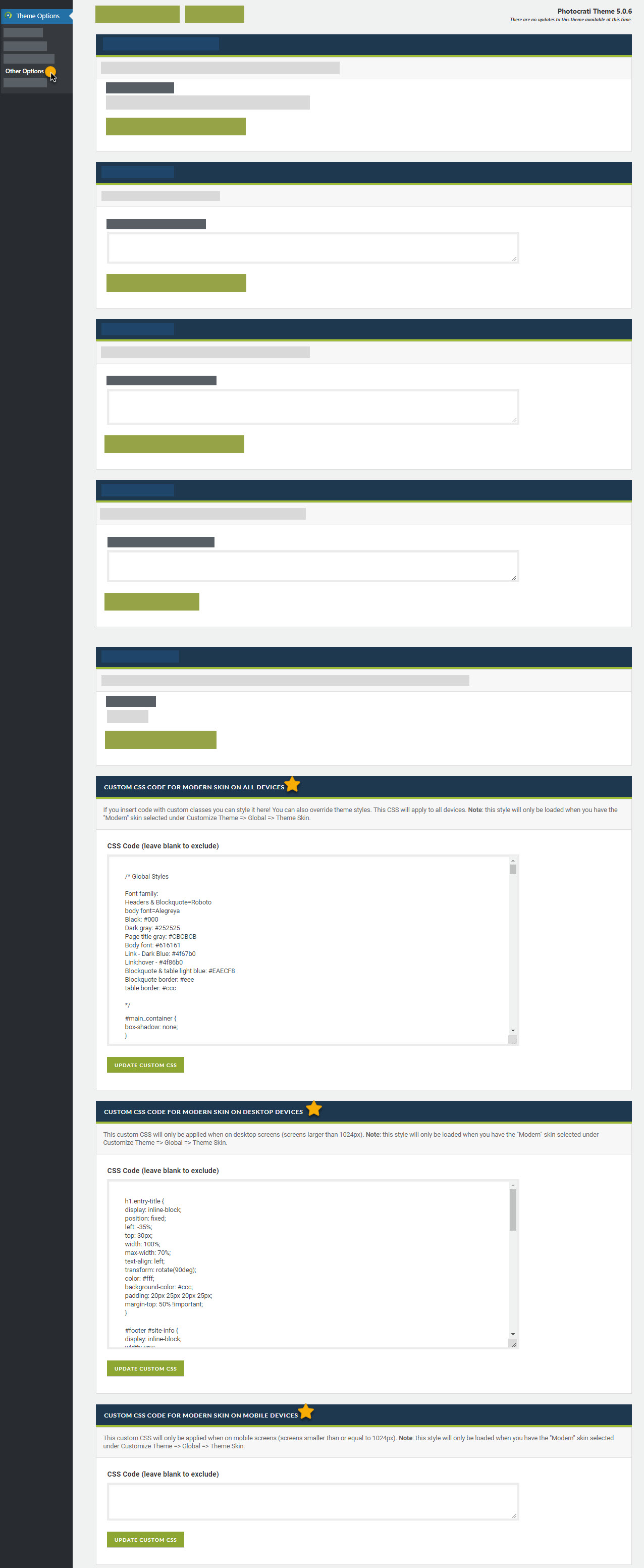
ADDING & EDITING CSS UNDER THEME OPTIONS > OTHER OPTIONS
To make additional style customizations to your site other than options already available – go to Theme Options >> Other Options > Custom CSS. Here you may insert your CSS code and even override theme styles.
The first Modern skin CSS stylesheet is for all displays. If you’d like to narrow down some specific CSS for only desktop or only mobile, there are two extra stylesheets for you to add that custom code to. The very last CSS stylesheet at the bottom of this page is for Legacy skin only, and will only apply if you have the Legacy theme skin active (we recommend that you upgrade to Photocrati Pro, with Modern skin active if you’re running a legacy version of the theme).

To make custom CSS changes to your theme, knowledge of CSS styling is needed. What will also be helpful is to use the browser Google Chrome to help discover which elements on your site are associated with what CSS #ID or .class .
